Builderius Reimagined - Our First Milestone!
The Builderius team has been quiet for a while, and we’d like to break that silence to share an update on our progress. While we’re eager to share, we’re still holding some information back until the 1.0 release. We aim to keep concrete details for the official release, but we’re ready to share some exciting developments.
Addressing the Delay
We recognize that launching the new Builderius has taken longer than anticipated. This delay is due to a few reasons, some less and some quite exciting. Firstly, Builderius is not yet our primary source of income, which means we must also dedicate time to client projects. Secondly, what began as a UI/UX redesign evolved into a more extensive project. The feedback we received and our closer examination of the no-code builders landscape led to a complete reimagining of Builderius. This reimagining isn’t only about Builderius but the concept of website builders in general. We’ve identified important gaps in this category of tools and are tackling them directly. Rest assured, we’re not trying to reinvent the wheel.
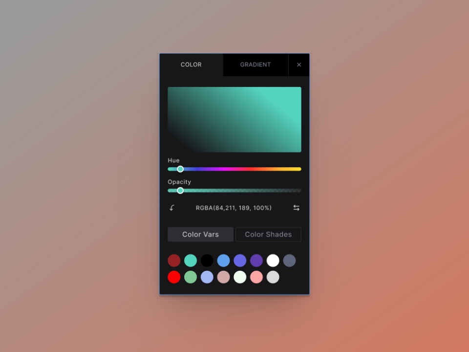
True to Web Platform Specifications
As of 2024, core web technologies are largely mature, making it more feasible to translate these technologies into a graphical UI almost directly. If done correctly, all advanced features can elegantly and logically scale up from these fundamentals. This enables us to keep up with the rapid innovation of these fundamental technologies. Any builder aiming to cater to professionals should be able to work with any aspect of HTML or CSS.
A Cosy UI Designed for Efficiency
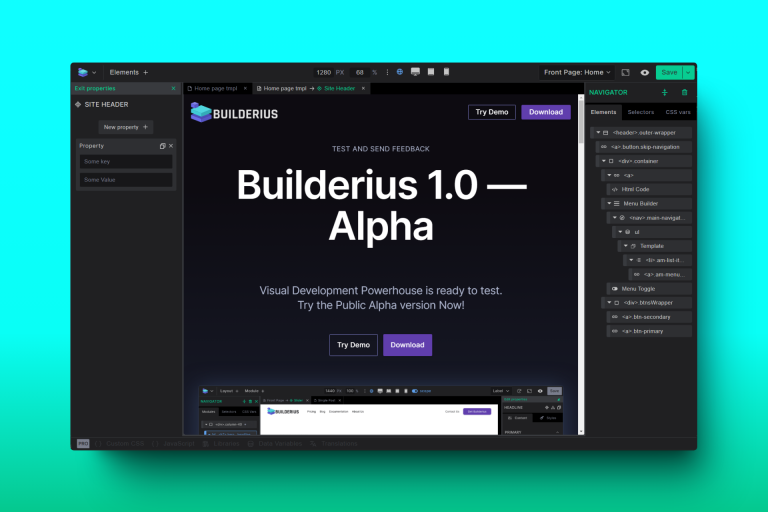
Several fundamental principles guide our UI and workflow design. We’re focused on reducing the number of clicks required to navigate our app. While progressive revealing does reduce information overload, we understand that users don’t want to navigate through multiple layers of the UI to access frequently used settings. It’s a balance. We aim to leverage users’ familiarity with other tools. If a feature exists elsewhere, we’ll adopt similar designs unless there’s a compelling reason to change it. Aesthetics matter, as users of no-code builders spend hours on these apps daily. The interface should be simple, calming, and pleasing to the eye. Sometimes, code is the best UX for a task, so it isn’t a second-class citizen here.
Update on Our Progress
We still have much to do, we kept some large parts from your view still, but we’ve made significant progress.
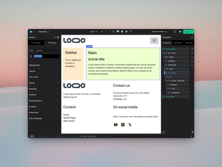
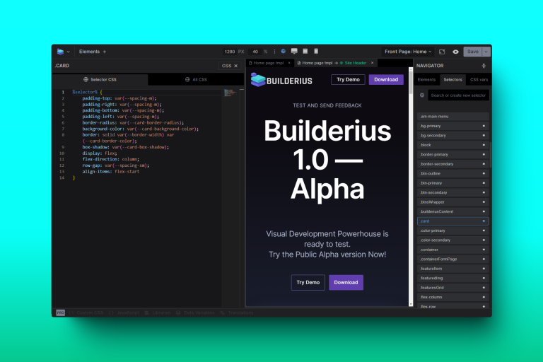
Currently, we’re finalizing what is likely the central part of the tool: the design tools. This includes a complete set of tools for working with modules and selectors, @rules, and CSS variables. These tools are reminiscent of similar builders but with features and flexibility that make them feel almost magical at times. As we conclude this stage, we’ll move on to finalize the work allready made on components.
Stay tuned for the next of our dev chronicles issue.
Builderius team.
