No Code Web Design Tools for Professional Designers are not Niche Products
Article
In this article, I delve into the domain of user-friendly web design tools, addressing arguments within the WordPress community, particularly in the context of Full Site Editing. Focusing on the evolution of the WordPress Block Editor and Site Editor, I discuss what I think the assumptions guiding their development are, emphasizing the potential of no code tools for design professionals. Drawing parallels with the historical evolution of Desktop Publishing, the article underscores the importance of intuitive interfaces and industry patterns. Overall, it advocates for a thoughtful approach to tool design and development, recognizing the significance of design professionals within the evolving landscape of No Code tools.
My Perspective, or My Bias
To clarify my perspective, I come from a design background, initially in graphic design and later in web/interactive design. Currently, I am a designer on the Builderius* team, a WordPress website builder – a professional, low-to-no-code tool for crafting websites. Additionally, I bring over 10 years of teaching experience in design at the university level. I perceive the design community as a significant user base for no-code tools, and I advocate for these tools to cater to the needs and expectations of professional designers.
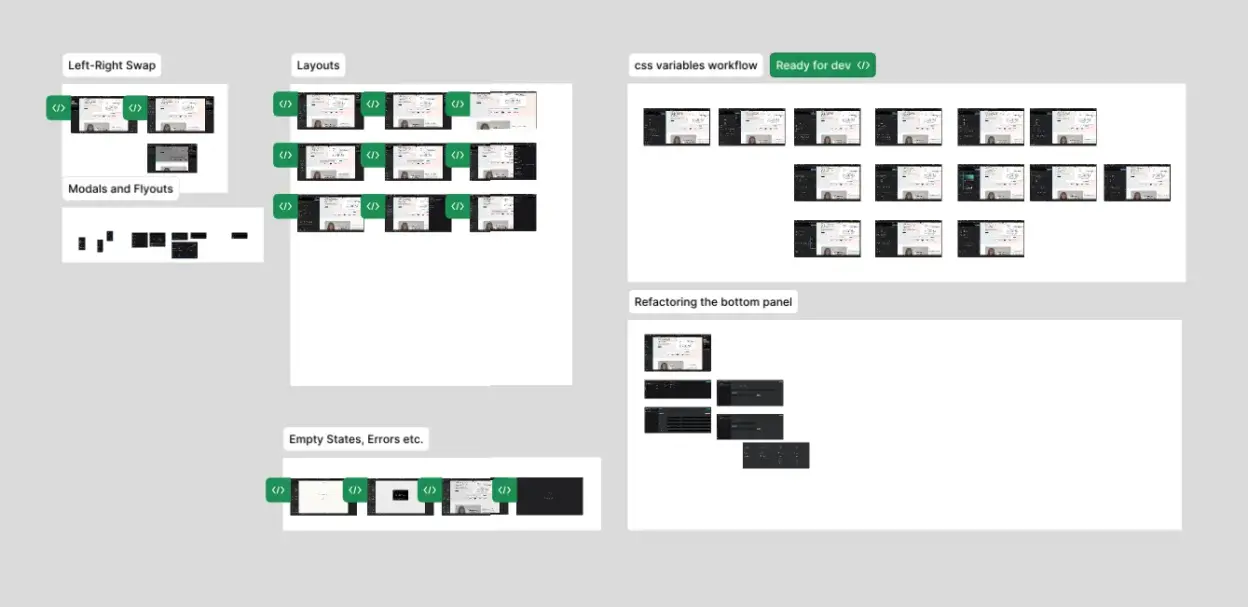
*Note: I joined Builderius a year ago to help design a completely new UI and UX, currently in development as of this writing. Here is a sneek peek of our working design file.

Why This Article?
This morning, I came across this Twitter post in my feed, sparking my interest. I frequently encounter arguments similar to the one presented in the post from enthusiasts of WordPress Full Site Editing, often from developers. The WordPress site editor, or the suite of tools enabling full site editing, is WordPress Core response to the broader trend in web development and design known as No Code Development or, more broadly, the No Code movement.
No Code?
I asked Chat GPT for a quick definition, and here is its response*.
The no-code movement refers to a growing trend in technology design and development where individuals with little to no programming expertise can create functional software applications without writing code, with writting much less of it. Instead of relying on traditional coding approach, no-code platforms offer intuitive interfaces and visual tools that enable users to design, customize, and deploy applications through a graphical interface. This movement aims to democratize software development, making it more accessible to a broader audience and empowering non-technical users to contribute to the creation of digital solutions. By eliminating the need for coding skills, the no-code movement accelerates the development process, fosters innovation, and enables a more inclusive approach to building software applications.
When I asked for a list of some well-known No Code tools for creating websites, here’s what I got:
- Webflow
- Wix
- Bubble
- Adalo
- WordPress (with Elementor)
- Squarespace
- Shopify
- Strikingly
* Note: I’m aware that Chat GPT doesn’t represent the authoritative resource for this topic. It is used here to provide basic information about No Code quickly.
WordPress Block Editor and Site Editor
WordPress Core has been developing its native response to the no-code challenge, aiming to compete with other solutions already present on their platform and outside of it. The naming of different aspects of their native no-code solution can be confusing, leading to constant debates. Here is my personal description: WordPress’s native No Code tooling is based on its “Block editor,” used for composing content and designing layouts (Block Patterns), templates (Site Editor), and site-wide styles (Style Book). The desired result is a unified experience across entire website management, covering both design and content editing tasks. To achieve this vision, the WordPress team focuses on being user-friendly for “non-professionals” or, in their terms, “for everyone.”
Practically, among other things this means they sometimes sacrifice flexibility or remove functionality in favor of a simpler interface. These design decisions stem from the assumption that “most people” creating websites do not need or understand some traditional controls used for web design. However, it’s essential to remember the more fundamental assumption behind native no-code tooling in WordPress which is that “most people” creating websites want to design layouts, templates, and site-wide styles more extensively than traditional WordPress theming allows.
Lastly, another assumption is that professionals creating websites for clients are a “minority,” or at least, professionals using no-code tools for client websites are a “minority.” Hence, a no-code tool catering to such users is, by definition, niche.
Design Professionals are not a Small Target Group
It’s crucial to frame this debate in order to understand its potential influence on perspectives. WordPress CMS is undoubtedly a major player in website creation. Its history, evolving from a blogging tool into a more general site-building solution, gives its community a unique angle toward no-code tools for website design and development. The primary frame is WordPress itself, making the widest possible user base “WordPress users.” From there, potential user groups include “Site Editor” users, “Elementor users,” “Classic theme users,” and so on. From this perspective, it may seem that design professionals needing a fully capable tool are potentially a small niche. Whether the perceived majority of “WordPress users,” bloggers, or DIYers are in fact interested in delving deep into website design, and whether the native no-code solution adequately addresses their needs, is another question.
No Code is Also a Subset of Desktop Publishing (DTP)
For those unfamiliar with Desktop Publishing, it began revolutionizing the design industry from the late ’80s through the ’90s with the advent of Graphical User Interfaces, Adobe Postscript technology, and digital printing technology. Previously, designing magazines, posters, and other graphic design products was done with analog tools, in a slower and more expensive manner. Desktop publishing digitized and “democratized” this process, resulting in a global explosion of design productivity. Companies like Corel, Macromedia and Adobe became giants with tools that became industry standards for design professionals. Web design lagged behind for a long time, lacking appropriate tools for designers. There were more or less successful attempts over the last three decades, such as the dreaded Dreamweaver and, for a while, beloved Flash, as well as smaller tools here and there.
Since tools for designers to create websites were mostly inadequate, the industry has split the process of website creation into design tools for creating mockups/prototypes (Photoshop, Fireworks, Sketch, InVision, Figma, Penpot) and tools for developers to implement the designs (code editors, IDEs, etc.).
With the rise of modern no-code tools like WebFlow, designers interested in the web are finally getting tools similar to those graphic designers have had for over 30 years. Or, at least, there is potential for these tools to develop into that.
WordPress is Big, but so is Adobe
Approaching various no-code tools on the market today from a “design-centric” perspective indicates that a capable, professional tool can become mainstream, with a potentially large target group. Despite being part of the WordPress community, most people around me are not “WordPress users.” They are either designers, students, or clients. In neither case do they identify with WordPress; it’s merely used for their CMS needs. In this context, viewing no-code tools as part of the history of desktop publishing makes sense. As a design teacher, I can also assert that design education is in high demand, and providing well-made tools for this design students and the educational process should be a high priority for any no-code tool aiming for ubiquity.
Intuitive UI Respects Standard Industry Patterns
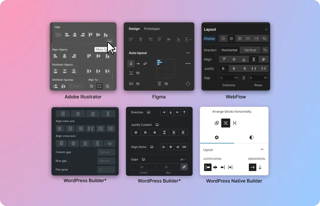
This article was inspired by a Twitter post that used a segment of UI designed to control the alignment of elements in a web design no-code tool. The argument in the post (check the author’s comments as well) suggests that the UI in question is non-intuitive, potentially making the tool niche.

However, this image argues the opposite. This alignment tool panel seamlessly fits into the industry standard for how alignment tools should look and function, as evident from various design tools presented. A user interface is intuitive when it acts as expected, and that expectation comes from previous experience. From this perspective, examining the WordPress native no-code implementation gives us an argument that it is, in fact, non-intuitive, as it deviates the most from all other tools in the image. In reality, this part of the WordPress block editor UI probably adheres the most to common industry patterns, with many other cases showing more significant differences in approach and implementation.
No Code Tools are Still Young
Most tools in the no-code space are still in their infancy, and the industry will need a bit more time to solidify, much like the graphic design industry has. However, creating tools for design professionals and focusing on supporting design education processes should be on the radar of ambitious tools out there.

Ready to build like a professional?
Transform your WordPress workflow with professional-grade visual development. No more compromising between speed and quality.