CSS Grid, OKLCH & Dark Mode: What Shipped and How it Works
Article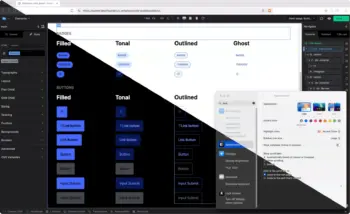
We rebuilt the CSS Framework color system, added native dark and light mode support, and shipped CSS Grid with full property controls. Here’s what that means and how it works.
The Color System Problem
Most CSS color systems work fine until you need to change something. You pick a primary blue, generate shades manually or with a tool, paste them into variables, and move on. Then the client wants a different blue. Or you need a secondary color. Or the shades look uneven, the mid-tones are muddy, the light end washes out.
This happens because most color generation uses HSL. HSL is convenient to write but perceptually uneven. A 10% lightness step at one hue looks nothing like a 10% step at another hue. Your color scales look hand-tuned because they have to be.
We wanted a system where you set one value and get a full, usable scale. No manual tuning. No fighting with mid-tones. And if you change the origin, every shade recalculates correctly.
OKLCH with Relative Color Syntax
The Builderius CSS Framework now generates every shade scale from a single origin value using OKLCH and relative color syntax.
Change the origin, buttons, badges, form fields, text styles all update. The shades are perceptually uniform, meaning they actually look evenly distributed across the scale. This is the core advantage of OKLCH over HSL, what you see matches what you’d expect.
Here’s the actual framework code. One origin value, eleven shades:
:root {
    --color--primary--original: oklch(0.539 0.211 274.926);

    --color--primary--50:  oklch(from var(--color--primary--original) 0.97 calc(c * 0.15) h);
    --color--primary--100: oklch(from var(--color--primary--original) 0.93 calc(c * 0.25) h);
    --color--primary--200: oklch(from var(--color--primary--original) 0.87 calc(c * 0.45) h);
    --color--primary--300: oklch(from var(--color--primary--original) 0.78 calc(c * 0.65) h);
    --color--primary--400: oklch(from var(--color--primary--original) 0.68 calc(c * 0.85) h);
    --color--primary--500: oklch(from var(--color--primary--original) 0.58 calc(c * 1.00) h);
    --color--primary--600: oklch(from var(--color--primary--original) 0.48 calc(c * 0.95) h);
    --color--primary--700: oklch(from var(--color--primary--original) 0.39 calc(c * 0.85) h);
    --color--primary--800: oklch(from var(--color--primary--original) 0.31 calc(c * 0.70) h);
    --color--primary--900: oklch(from var(--color--primary--original) 0.25 calc(c * 0.50) h);
    --color--primary--950: oklch(from var(--color--primary--original) 0.18 calc(c * 0.40) h);
}
Each shade takes the origin’s hue (h) and chroma (c), then adjusts lightness and scales the chroma to keep things balanced. Change --color--primary--original to any OKLCH value and every shade recalculates. Every component using those variables updates, buttons, badges, form focus states, text accents, everything.
The base scale (neutrals) works the same way but borrows the hue from the primary while keeping chroma near zero. This gives your grays a subtle tint that feels cohesive with the primary color instead of flat:
:root {
    --color--base--50:  oklch(from var(--color--primary--original) 0.97 0.008 h);
    --color--base--100: oklch(from var(--color--primary--original) 0.93 0.010 h);
    --color--base--200: oklch(from var(--color--primary--original) 0.87 0.012 h);
    /* ... through 950 */
}
Components then reference these scales through semantic variables. A filled button doesn’t point to a raw color, it points to a purpose:
:root {
    --button--filled-bg-enabled: var(--color--primary--500);
    --button--filled-bg-hovered: var(--color--primary--600);
    --button--filled-bg-pressed: var(--color--primary--700);
    --button--filled-tx-enabled: var(--color--base--0);
}
Same pattern for badges, form elements, accordions, tables, every component in the framework uses the same color tokens.
The framework ships with just the primary scale. This is intentional, it’s minimal by design. Adding a secondary color takes seconds. Duplicate the primary block, rename primary to secondary, change the origin:
:root {
    --color--secondary--original: oklch(0.769 0.238 142.774);

    --color--secondary--50:  oklch(from var(--color--secondary--original) 0.97 calc(c * 0.15) h);
    --color--secondary--100: oklch(from var(--color--secondary--original) 0.93 calc(c * 0.25) h);
    /* Same pattern, full scale from one value */
}
In the video, I do this live, duplicate, find-and-replace, change the hue. About a minute from start to working secondary color with all shades.
Native Dark and Light Mode
The dark mode implementation is straightforward because the scale architecture makes it possible. In dark mode, the shade order inverts, 50 becomes the darkest, 950 becomes the lightest. Same origin, same chroma scaling, reversed lightness:
@media (prefers-color-scheme: dark) {
    :root {
        --color--primary--50:  oklch(from var(--color--primary--original) 0.18 calc(c * 0.40) h);
        --color--primary--100: oklch(from var(--color--primary--original) 0.25 calc(c * 0.50) h);
        --color--primary--200: oklch(from var(--color--primary--original) 0.31 calc(c * 0.70) h);
        /* ... inverted through 950 */
        --color--primary--950: oklch(from var(--color--primary--original) 0.97 calc(c * 0.15) h);

        --color--base--0: oklch(0 0 none);
        --color--base--50:  oklch(from var(--color--primary--original) 0.18 0.006 h);
        /* ... base scale inverts too */
        --color--base--1000: oklch(1.00 0 none);
    }
}
Because every component uses the same color tokens, the entire UI adapts. --button--filled-bg-enabled still points to --color--primary--500, but 500 is now recalculated for dark mode. No duplicate stylesheet, no component-level overrides, the scale inversion handles it.
The framework ships with @media (prefers-color-scheme: dark) out of the box. Switch your Mac to dark mode, the site follows. No setup needed.
Most sites also want a user-facing toggle so visitors can override their system setting. The framework doesn’t include one by default, but in the video I build one, a button with sun and moon SVGs and a small script that adds a .theme-dark class to :root. To make it work, you also need to add .theme-dark to your dark mode CSS block so the class triggers the same scale inversion:
@media (prefers-color-scheme: dark) {
    :root {
        /* dark scale values */
    }
}

:root.theme-dark {
    /* same dark scale values */
}
This way, the OS preference works on its own, and when the toggle adds .theme-dark, it takes priority regardless of the system setting.
You can also override individual dark mode values when the auto-generated inversion isn’t quite right. The system gives you a working dark theme by default, but you have full control to adjust specific tokens.
You don’t have to build the toggle yourself. I’ve put together a ready-made component you can import directly into Builderius, the button element, sun and moon SVGs, the JavaScript, all the classes. Open the JSON file, copy the contents, open Builderius, and paste the contents into your layout. Everything comes in wired up and working.
Open and copy the dark/light toggle component (JSON) →
CSS Grid
Builderius now supports CSS Grid with the full property set. Not a simplified version, not an abstraction, the actual CSS Grid spec, available through visual controls and the code editor.
Container Properties
grid-template-columns, grid-template-rows, justify-items, align-items, justify-content, align-content, gap, grid-auto-flow, grid-auto-columns, grid-auto-rows.
Grid Child Properties
grid-column, grid-row, align-self, justify-self, order.
All standard CSS units are supported, along with clamp() and minmax(). You can build everything from basic equal-column layouts to responsive grids that reflow without media queries to asymmetric bento-style layouts with explicit placement.
The framework already includes a responsive grid utility using CSS custom properties:
.grid {
    display: grid;
    grid-template-columns: repeat(
        auto-fit,
        minmax(var(--grid--item-min-width), var(--grid--item-max-width))
    );
    gap: var(--spacing--md);
    width: 100%;
}
You can adjust --grid--item-min-width and --grid--item-max-width to control the reflow behavior, or build your own grid from scratch using the visual controls.
Basic Grid
Set display to grid, define your columns, add gap. Three properties, working grid.
.my-grid {
    display: grid;
    grid-template-columns: repeat(4, 1fr);
    gap: var(--grid--gap);
}
Responsive Without Media Queries
Replace fixed column counts with auto-fit and minmax. The grid decides how many columns fit based on available space. Cards reflow from four columns to three to two to one, automatically.
.my-grid {
    display: grid;
    grid-template-columns: repeat(auto-fit, minmax(280px, 1fr));
    gap: clamp(1rem, 2vw, 2rem);
}
Gap supports clamp() too, so spacing is fluid, tighter on small screens, more breathing room on large ones.
Spanning and Placement
Tell individual items where to go. Span a card across two columns, another across two rows. Build asymmetric layouts where a featured item takes a hero position and the rest fill in around it.
.featured {
    grid-column: span 2;
}

.tall {
    grid-row: span 2;
}
Alignment
Full alignment control on both the container and individual items. align-items and justify-content on the container, align-self and justify-self on children to override. Same logic as flexbox, just applied to grid tracks.
Auto-flow
Controls how items fill the grid. Default is row, left to right, top to bottom. Switch to dense and the grid backfills gaps when items span multiple tracks. Useful when you want a tight layout without empty cells.
Order
Rearrange visual order without changing HTML structure. The DOM stays untouched, only the visual placement changes.
UI and Code
Everything shown through visual controls is standard CSS underneath. Open the code editor and you see the same properties, same values. grid-template-columns, gap, align-items, exactly what you’d write by hand.
Builderius doesn’t abstract any of this away or generate its own syntax. If you’d rather type it out instead of using the controls, you can. Both ways produce the same result.
Watch the Full Video
This walkthrough covers everything, the OKLCH color system, creating a secondary scale from scratch, dark/light mode with OS detection and a custom toggle, and CSS Grid from basic layouts to spanning to auto-flow. Everything is built live, from scratch, inside the builder.
What’s in This Release
CSS Framework:
- OKLCH color system with relative color syntax
- Primary, base, error, and success scales generated from origin values
- Base scale tinted from primary hue for cohesive neutrals
- Native dark/light mode via
prefers-color-schemeand.theme-darkclass - Semantic component tokens (buttons, badges, forms, accordions, tables)
CSS Grid:
- Full container property support (template columns/rows, gap, alignment, auto-flow)
- Full child property support (column, row, align-self, justify-self, order)
- All units,
clamp(),minmax()support - Built-in
.gridutility class with configurable custom properties - Visual controls and code editor
Full technical details in the Release notes.
Get Started
CSS Grid and the code editor are Pro features. The OKLCH color system and dark mode support are included in the free version, but the visual grid controls, code editor, and full CSS customization require a Pro license.
Want to see it in action first? Try the Pro demo, no signup needed. Full access to grid controls, code editor, and the complete CSS Framework.
Ready to build? Pro licenses start at $69 for a single site, or $179 for unlimited sites. Both are lifetime, no recurring fees. Get your license →
Already using Builderius Pro? Update to the latest version. The new CSS Framework and Grid controls are available immediately.
Have questions? Join the Builderius community with 2,000+ developers, or check the documentation.

Ready to build like a professional?
Transform your WordPress workflow with professional-grade visual development. No more compromising between speed and quality.