Create a Table of Contents Custom Module
 Elvis Krstulović
Photo by: Austin Kleon
Some of our users have asked us weather we would make a TOC module for use with their posts. The features mentioned were that it builds itself automatically from the headings present in the content. Another one was to be able to place it wherever one wants, and decide which of the heading levels to take into account. At the moment we have stopped with adding new features to Builderius as we are now fully focused on the new UI release, but with the new UI release this is quite likely the module you can expect.
However, a couple of “googles” away and we have a solution for you in form of a custom module. You can follow this tutorial in two ways:
- follow the steps I am taking, this is going to be good training helping you to learn your way arrount Builderius
- skim through and use the snippets I will be sharing in this post
We Will Be Making This
The JavaScript Part
I have stumbled upon Chris Ferdinandi GitHub repo with a nice Vanilla JS implementation of TOC. Of the ones I encountered this one seems to do it the best. We will use his script to base our module of of.
We will use his code, but will slightly edit to make it all sit in one place and be simpler to manage. Bellow you see the entire thing.
/*! tableOfContents.js v1.0.0 | (c) 2020 Chris Ferdinandi | MIT License | http://github.com/cferdinandi/table-of-contents */

/*
 * Automatically generate a table of contents from the headings on the page
 * @param  {String} content A selector for the element that the content is in
 * @param  {String} target  The selector for the container to render the table of contents into
 * @param  {Object} options An object of user options [optional]
 */
var tableOfContents = function (content, target, options) {

// Smooth scroll
	document.querySelector("html").setAttribute("style", "scroll-behavior: smooth")

	//
	// Variables
	//

	// Get content
	var contentWrap = document.querySelector(content);
	var toc = document.querySelector(target);
	if (!contentWrap || !toc) return;

	// Settings & Defaults
	var defaults = {
		levels: 'h2, h3, h4, h5, h6',
		heading: 'Table of Contents',
		headingLevel: 'h2',
		listType: 'ul'
	};
	var settings = {};

	// Placeholder for headings
	var headings;


	//
	// Methods
	//

	/**
	 * Merge user options into defaults
	 * @param  {Object} obj The user options
	 */
	var merge = function (obj) {
		for (var key in defaults) {
			if (Object.prototype.hasOwnProperty.call(defaults, key)) {
				settings[key] = Object.prototype.hasOwnProperty.call(obj, key) ? obj[key] : defaults[key];
			}
		}
	};

	/**
	 * Create an ID for a heading if one does not exist
	 * @param  {Node} heading The heading element
	 */
	var createID = function (heading) {
		if (heading.id.length) return;
		heading.id = 'toc_' + heading.textContent.replace(/[^A-Za-z0-9]/g, '-');
	};

	/**
	 * Get the HTML to indent a list a specific number of levels
	 * @param  {Integer} count The number of times to indent the list
	 * @return {String}        The HTML
	 */
	var getIndent = function (count) {
		var html = '';
		for (var i = 0; i < count; i++) {
			html += '<' + settings.listType + '>';
		}
		return html;
	};

	/**
	 * Get the HTML to close an indented list a specific number of levels
	 * @param  {Integer} count The number of times to "outdent" the list
	 * @return {String}        The HTML
	 */
	var getOutdent = function (count) {
		var html = '';
		for (var i = 0; i < count; i++) {
			html += '</' + settings.listType + '></li>';
		}
		return html;
	};

	/**
	 * Get the HTML string to start a new list of headings
	 * @param  {Integer} diff  The number of levels in or out from the current level the list is
	 * @param  {Integer} index The index of the heading in the "headings" NodeList
	 * @return {String}        The HTML
	 */
	var getStartingHTML = function (diff, index) {

		// If indenting
		if (diff > 0) {
			return getIndent(diff);
		}

		// If outdenting
		if (diff < 0) {
			return getOutdent(Math.abs(diff));
		}

		// If it's not the first item and there's no difference
		if (index && !diff) {
			return '</li>';
		}

		return '';

	};

	/**
	 * Inject the table of contents into the DOM
	 */
	var injectTOC = function () {

		// Track the current heading level
		var level = headings[0].tagName.slice(1);
		var startingLevel = level;

		// Cache the number of headings
		var len = headings.length - 1;

		// Inject the HTML into the DOM
		toc.innerHTML =
			'<' + settings.headingLevel + '>' + settings.heading + '</' + settings.headingLevel + '>' +
			'<' + settings.listType + '>' +
				Array.prototype.map.call(headings, function (heading, index) {

					// Add an ID if one is missing
					createID(heading);

					// Check the heading level vs. the current list
					var currentLevel = heading.tagName.slice(1);
					var levelDifference = currentLevel - level;
					level = currentLevel;
					var html = getStartingHTML(levelDifference, index);

					// Generate the HTML
					html +=
						'<li>' +
							'<a href="#' + heading.id + '">' +
								heading.innerHTML.trim() +
							'</a>';

					// If the last item, close it all out
					if (index === len) {
						html += getOutdent(Math.abs(startingLevel - currentLevel));
					}

					return html;

				}).join('') +
			'</' + settings.listType + '>';
	};

	/**
	 * Initialize the script
	 */
	var init = function () {

		// Merge any user settings into the defaults
		merge(options || {});

		// Get the headings
		// If none are found, don't render a list
		headings = contentWrap.querySelectorAll(settings.levels);
		if (!headings.length) return;

		// Inject the table of contents
		injectTOC();

	};


	//
	// Initialize the script
	//

	init();

};

tableOfContents('[data-toc-content]', '[data-toc]', {
	levels: 'h2, h3, h4, h5, h6', // The heading levels to generate a table of contents from
	heading: '', // 'Table of Contents', // The heading text for the table of contents list
	headingLevel: 'h2', // The level to use for the heading for the table of contents list
	listType: 'ul' // The list type to use for the table of contents
});
First, at line 10, we are adding smooth scroll to the html element of the page so that when we click on TOC elements our page transitions smoothly to the desired location.
Then at the very end of the code block, line 191 is where we initiate the script and edit any parametres we wish to configure. We will come back to this part.
What Tools do We Need?
- Builderius Site Builder
- Meta Box Plugin or ACF
The Desired Result
- TOC will use position sticky so that as we scroll it remains available for us to keep clicking and navigating the long post
- TOC will not be open all of the time but rather hidden behind the toggle so that it does not get in the way if we do not want it
- TOC will not be produced on the posts that do not need it, so we will allow editors of posts to decide if TOC should appear on the post or not
Add the JS to the Template First
We want our JS to run only where we will be using it, so add it to the Template scope. This JS stops running early (bail early) if there is nothing to do on the post, but still, we should not add JS globally unless we are certain we will be using it in many different places. If we only use it on posts, single post template is an appropriate scope for the script.
Create the Layout for the TOC
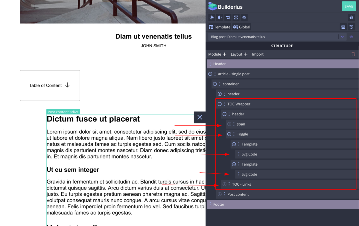
The part of the template structure that is framed is our TOC module. Its main wrapper, the “TOC Wrapper” is an <aside> HTML element. It does not need to be this, but I decided this one to be a good choice. The header is actually a <div> and it holds the text element and <builderius-toggle>, our universal interactive module that can toggle any element(s) you tell it to toggle without custom code, and lastly “TOC – Links” is a <div> where the JavaScript we added previously will insert the links into.
The CSS, or The Functional Styling
How you want this to look is entirely on you, however two styling decisions will make this solution a coherent UX. We need this element to be fixed once it comes to the top of the page, so it stays available, and it should not block-out too much of the post content.
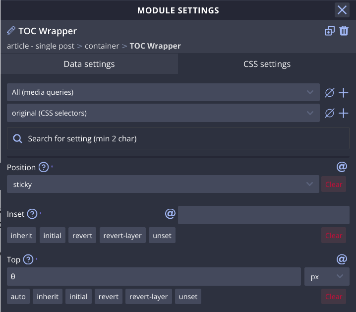
Select the TOC Wrapper element and in CSS Settings > Position, set it to “sticky” and top to “zero”. As for the size I have outdented the whole block, and made it as wide as its content content is, plus some padding.
Configure the Toggle Module
When you insert the toggle module it will look like this:
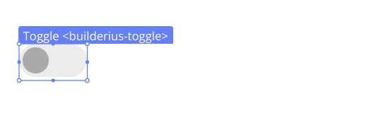
Although this icon and the variants we provide are very nice, this is not suitable for our case in my opinion, so we will make a custom toggle design using SVG modules placed inside Template modules.
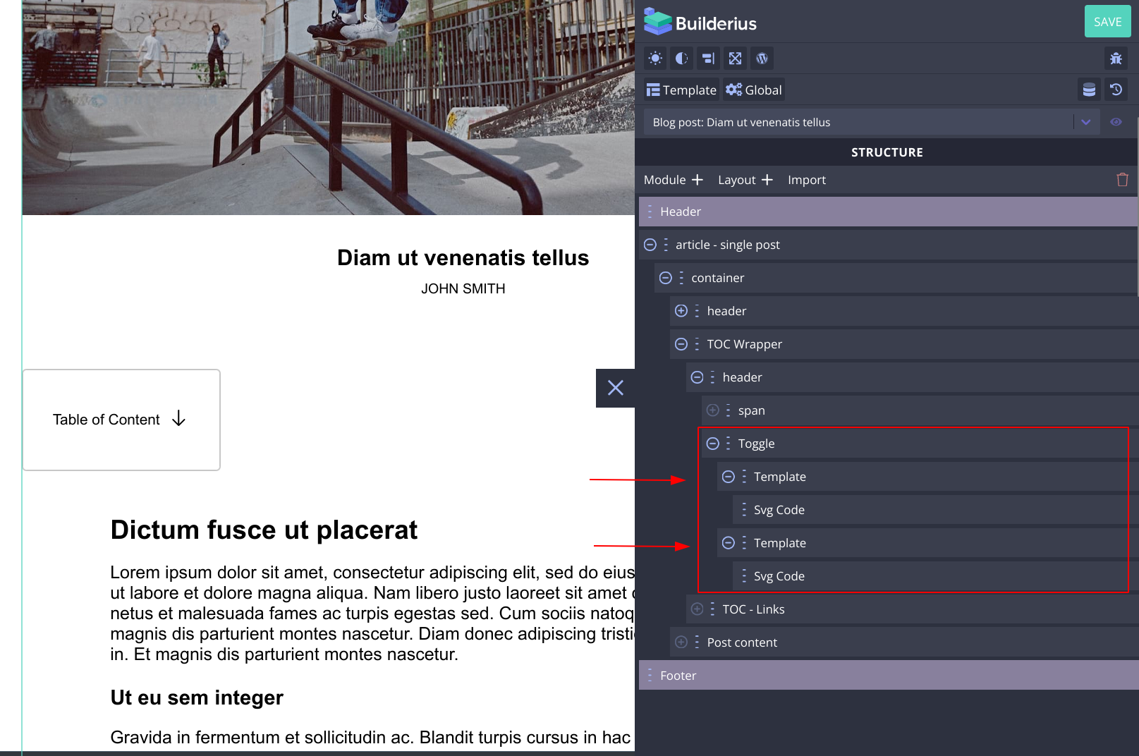
Now we have to tell the template modules which one should render based on weather the toggle module has been toggled off or toggled on.
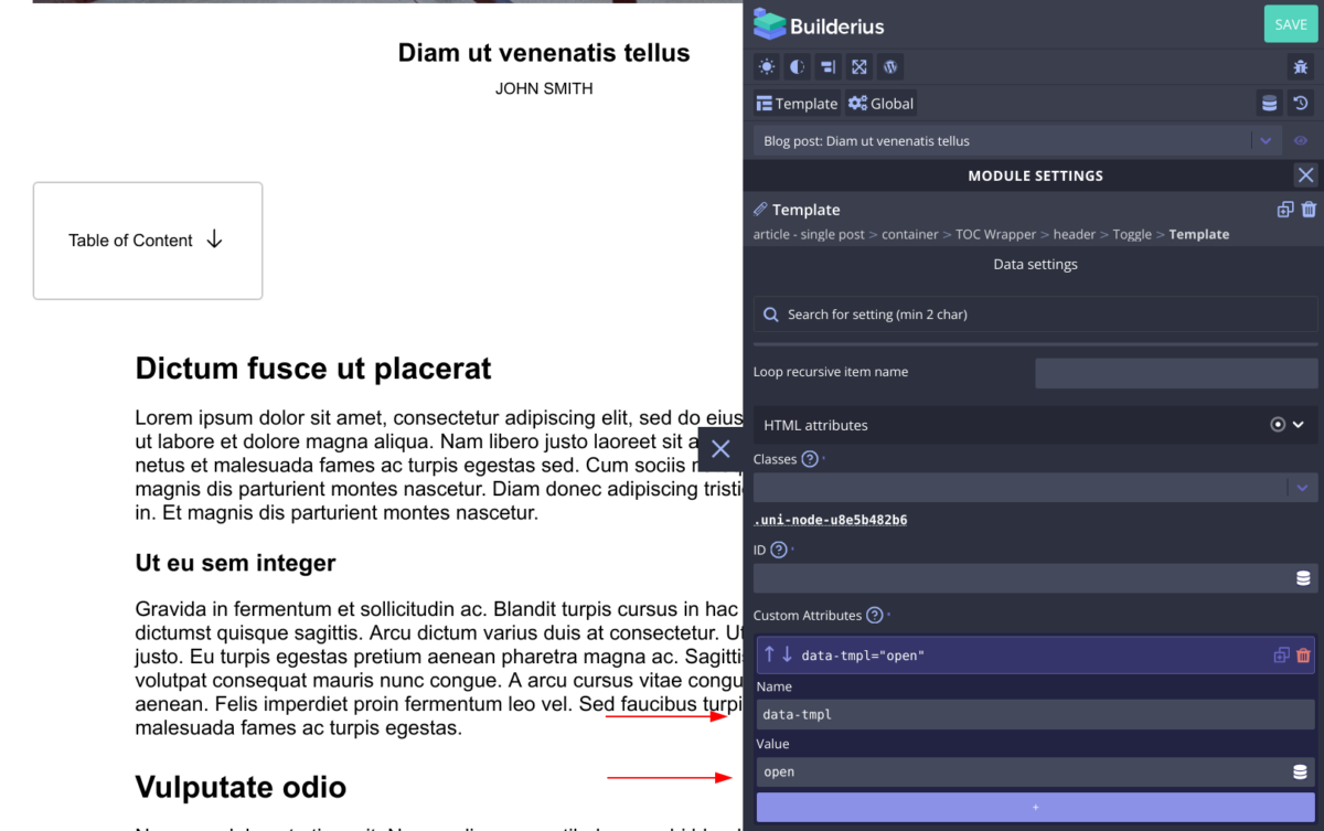
- Create a custom attribute, give it a name of
data-tmpland the value ofopen. This will make this template module show its content when the toggle module is toggled on. - Do the exact same thing for the second template module only change the value to
close. - Put the svg modules inside each template modules to create icon that you like, or add text element inside and have a text-based toggle that way.
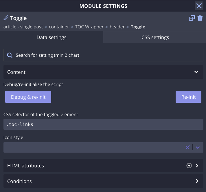
- Lastly, select the Toggle module itself and look for the field called “CSS selector of the toggled element”. Inside of it write the valid selector of the element you wish to be toggled with the toggle module. In our case this will be the div that wraps the generated list of elements. I have chosen it to be a classname
.toc-links. Write the dot, so that the module “knows” it is a class.
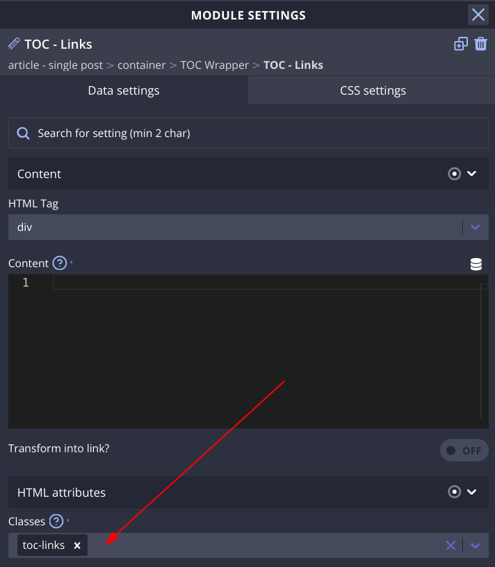
Make sure to add the class to the TOC Links module.
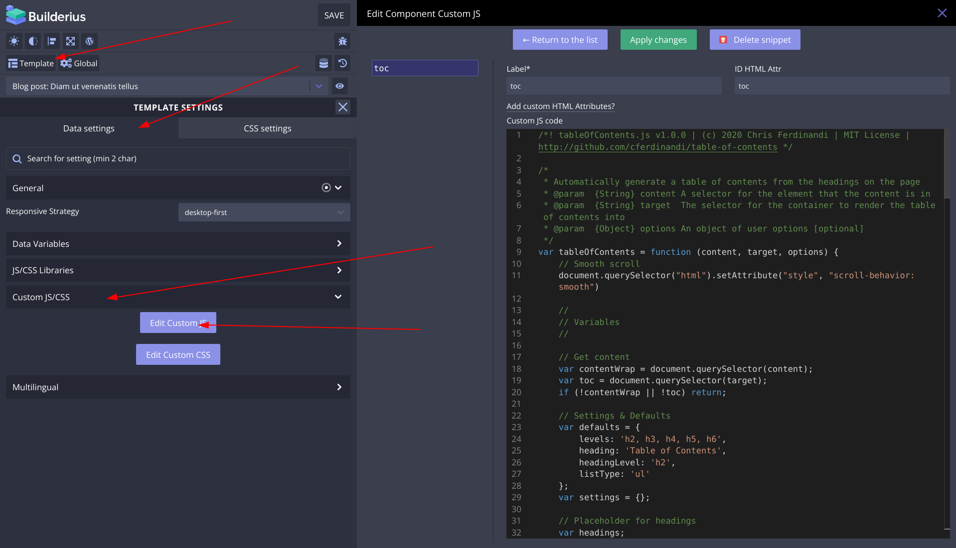
Adding Custom Attributes to the Modules so that JavaScript can do its Work
tableOfContents('[data-toc-content]', '[data-toc]', {
	levels: 'h2, h3, h4, h5, h6',
	heading: '',
	headingLevel: 'h2',
	listType: 'ul'
});
In the line one, you can see two parametres for this function, these are custom attributes it needs to work with our modules. First one [data-toc-content] should be placed on the container where the headings will be in, in our case this is post content wrapper, and second one [data-toc] needs to go on the element where we want the links to be inserted in. The rest of the parametres seems self-explanatory enough.
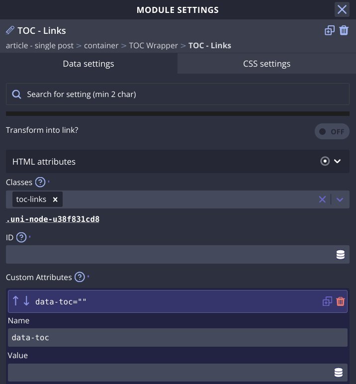
We then add [data-toc] to our TOC Links module.
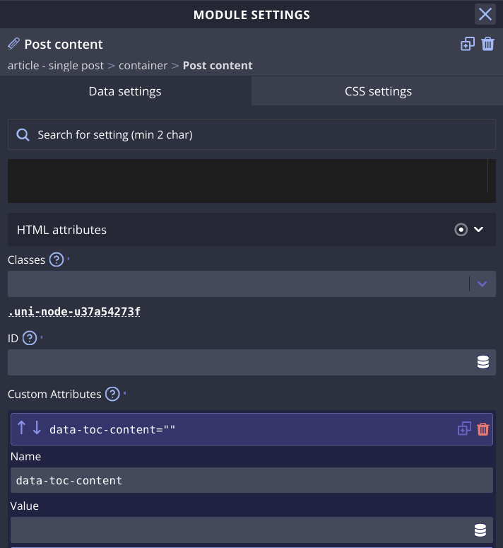
And our Post Content module gets [data-toc-content] attribute. Neither of the two gets any value, just give the attributes their name.
Adding CSS to Show Hide the “TOC – Links” With the Toggle Module
Toggle module does not make any assumptions as to what you want to happen with the element that is toggled, it simply adds a class .is-activated to the elements you point it to. So now is the time to add a selector and appropriate style to do the toggling. I will use display “none” to hide, and display “block” to reveal the generated TOC Link list.
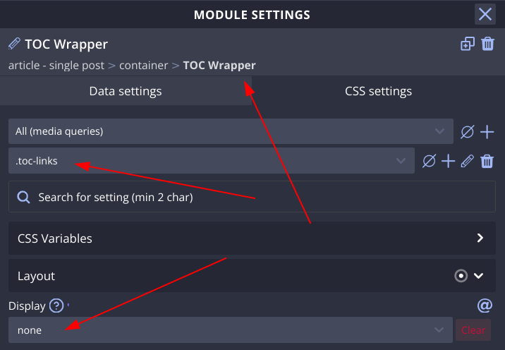
I will place the selector on the TOC Wrapper module, and set them to hide the TOC Links module.
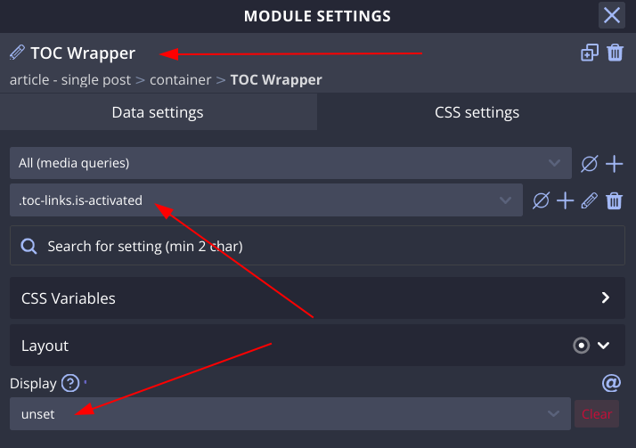
Then I will create the modifier selector like in the image to reveal the TOC Links module when the toggle module is toggled on.
That is it. Our TOC Module now works. But Let’s give the site editors a way to control weather to show it or not.
Setting up Metabox field to control weather to show the TOC
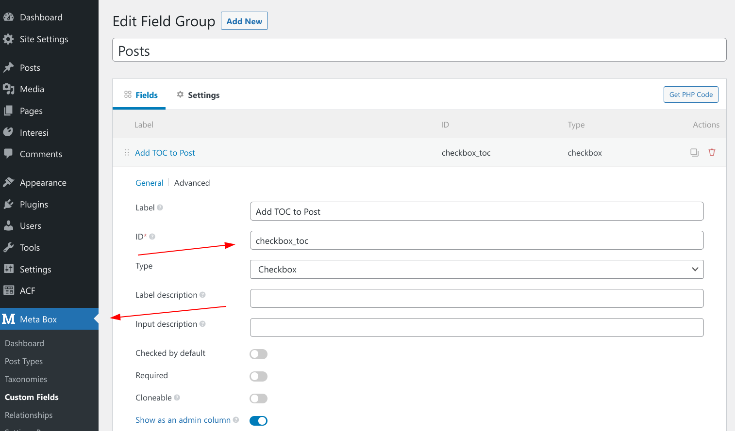
I have made a checkbox, in the field group for posts, and I have placed it in the sidebar of the editor.
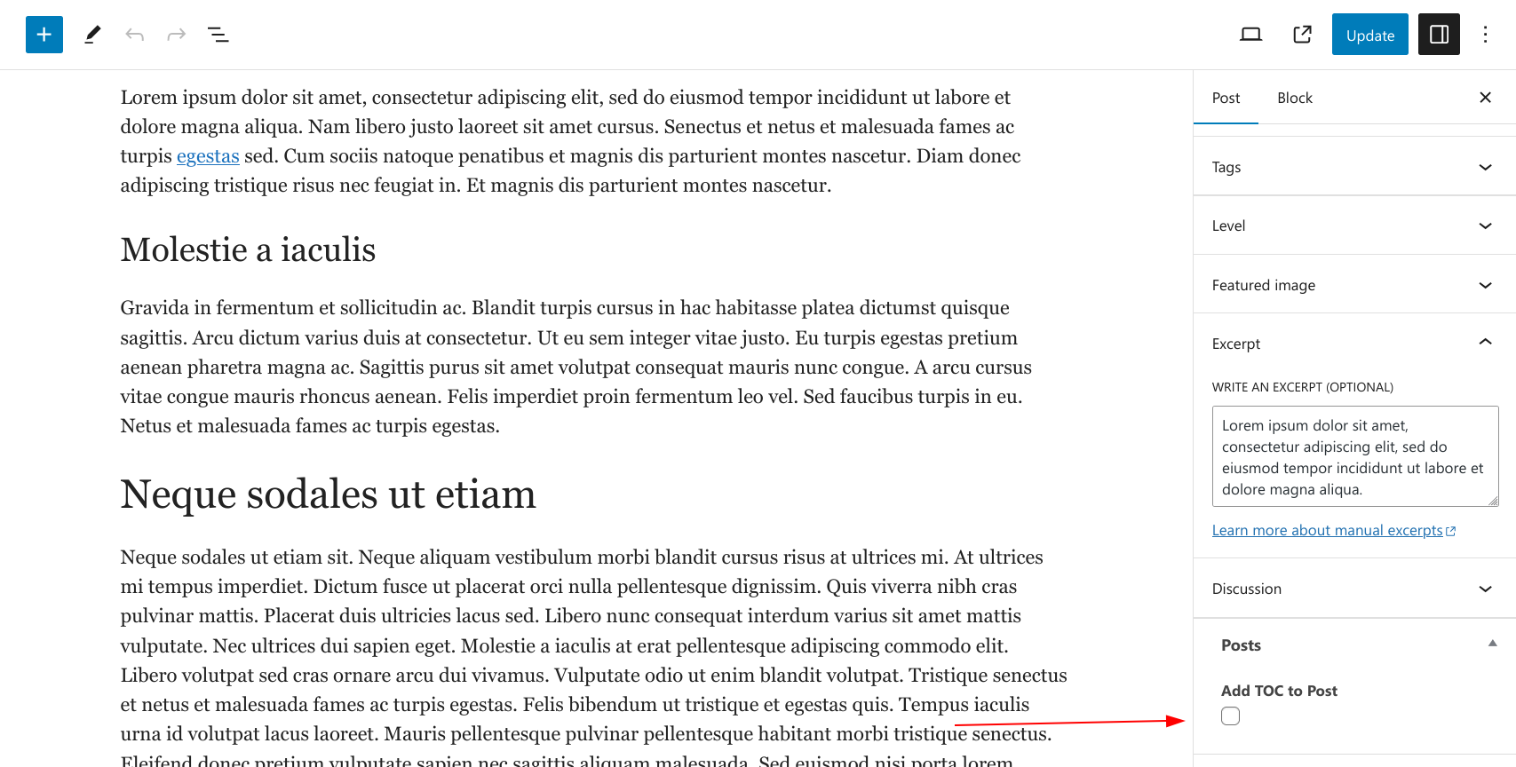
This gives me this simple UI that I can use or the site editors can use to add TOC to the post or not.
Adding Condition to the TOC Module
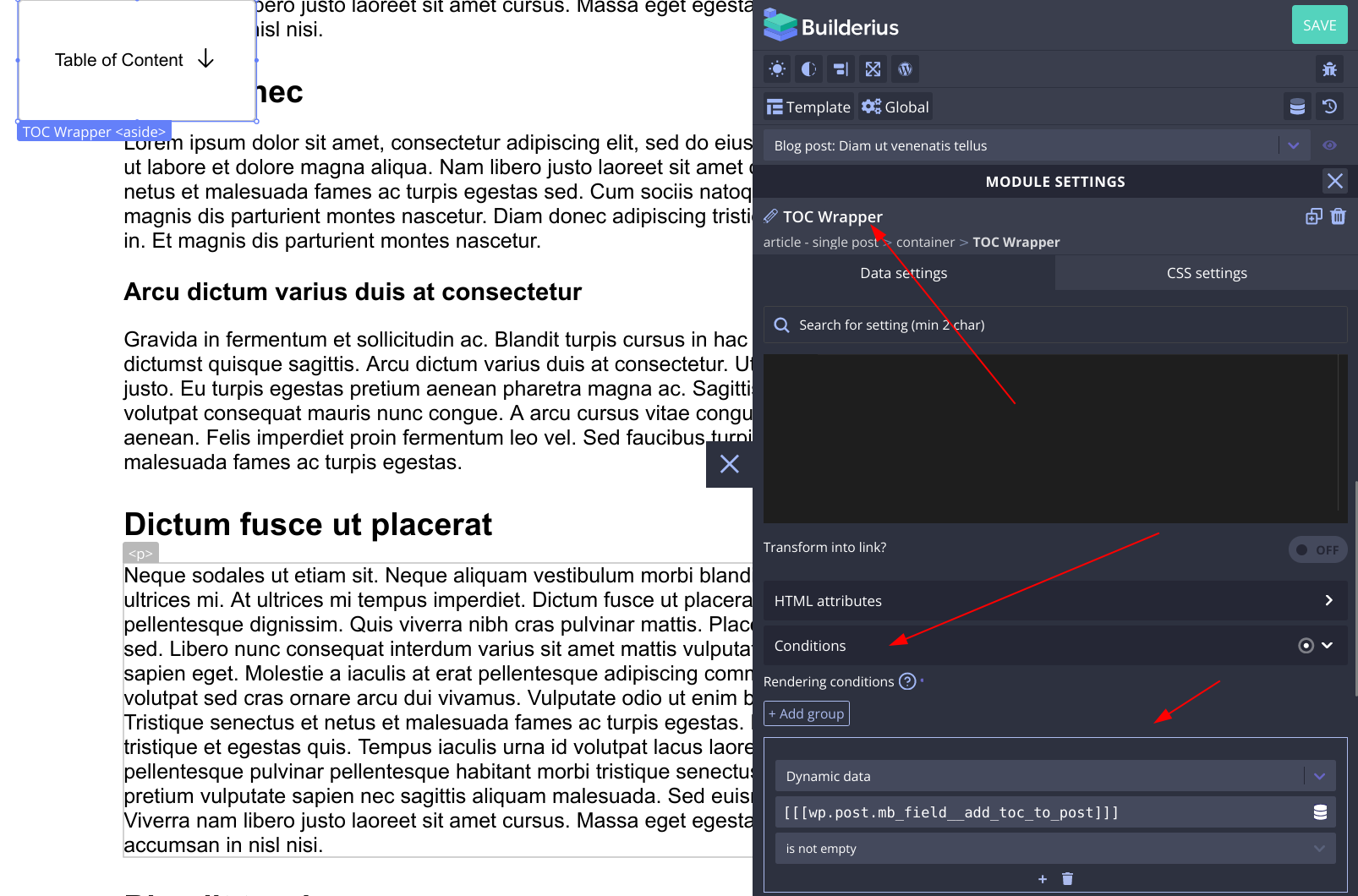
On the TOC Wrapper module I have set my conditions to be:
- Dynamic Data
- I selected my metabox field from the list
- I set it to be “is not empty”
And we are done!
For those of you that do not want to go over all these steps you can use this json to import the finished custom module.
Here is how to use this link to add module to your template. After you have added the JS to the template, do this:
That is it, cheers.