Create CSS Only Masonry Gallery with Zero Custom Code
 Elvis Krstulović
Masonry Layout is a kind of grid layout where items in the grid have different proportions. The problem masonry layout solves is that it removes uneven gaps between items that are caused by the fact grid items are not of the same proportions while not croping the items themselves. Masonry layouts can be used to display images only, or any other block type items.
To achive this feature we are going to use a native CSS feature called CSS Columns that we made available in Buidlerius Website Builder from version 0.13.0. So let’s start.
1. Prepare the layout first

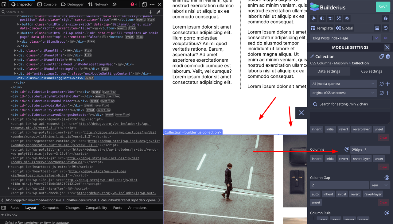
I will be using our “Dynamic Gallery” module for this demonstration, but since this module by default ships with CSS Grid layout applied, and the images used are of same proportions one first has to remove these styles, and replace the images to start fresh. To remove grid layout, select the Collection module, then go to css settings, then layout and there remove all grid related styles.
Then pull from some other dynamic source of images that has images of different proportions. I have used this remote image source (click on Raw Data, then copy all the json) for this demonstration and pasted it to the Collection module. If you need to see how this works please refer to our Collection Module documentation here (short video is on the bottom).
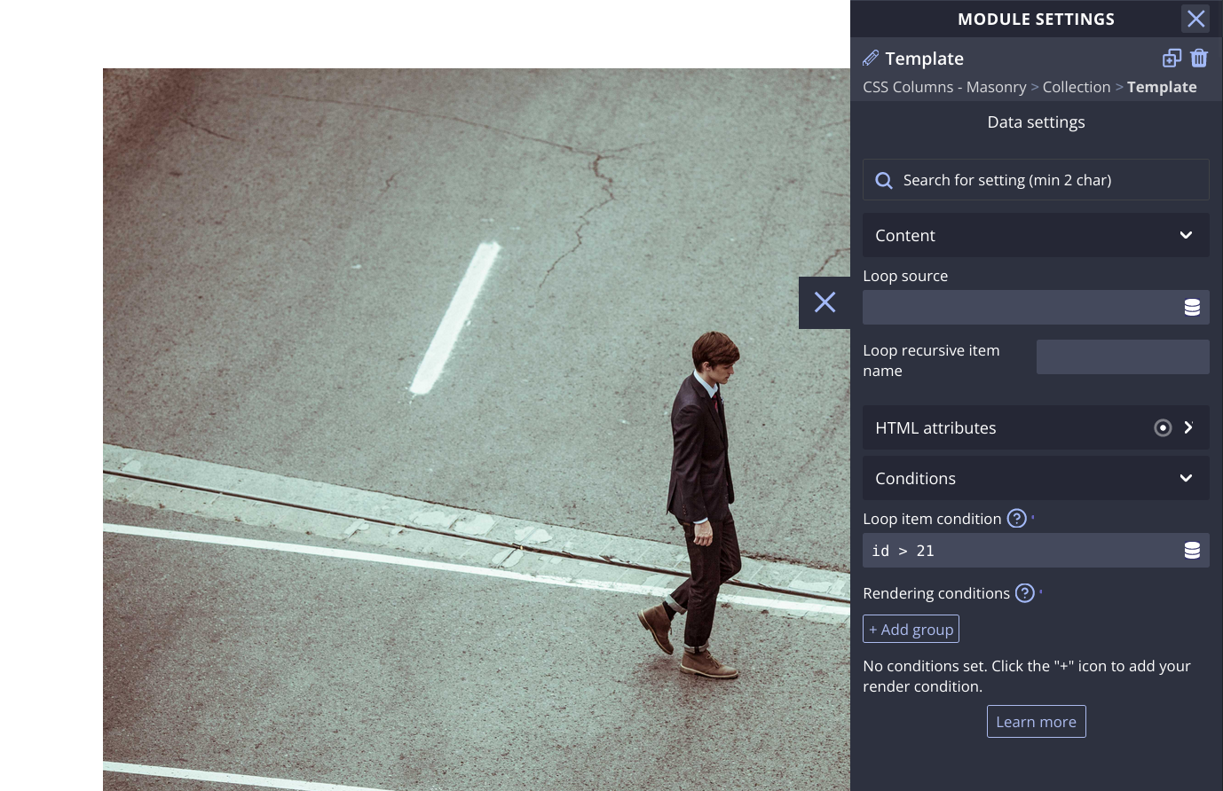
Because first 20 images are of the same proportions in this list of images, I have created a “Loop item Condition” on the Tempalte module inside the Collection to show only items whose ID is bigger then 21. I did this so I can see only images with different proportions that happen to start from 21st item onwards.
See the image bellow.
If you do now want to use the Dynamic Gallery, use Gallery module. In that case just remove the CSS Grid Styles from the Figure element and add your images from the WordPress Library.
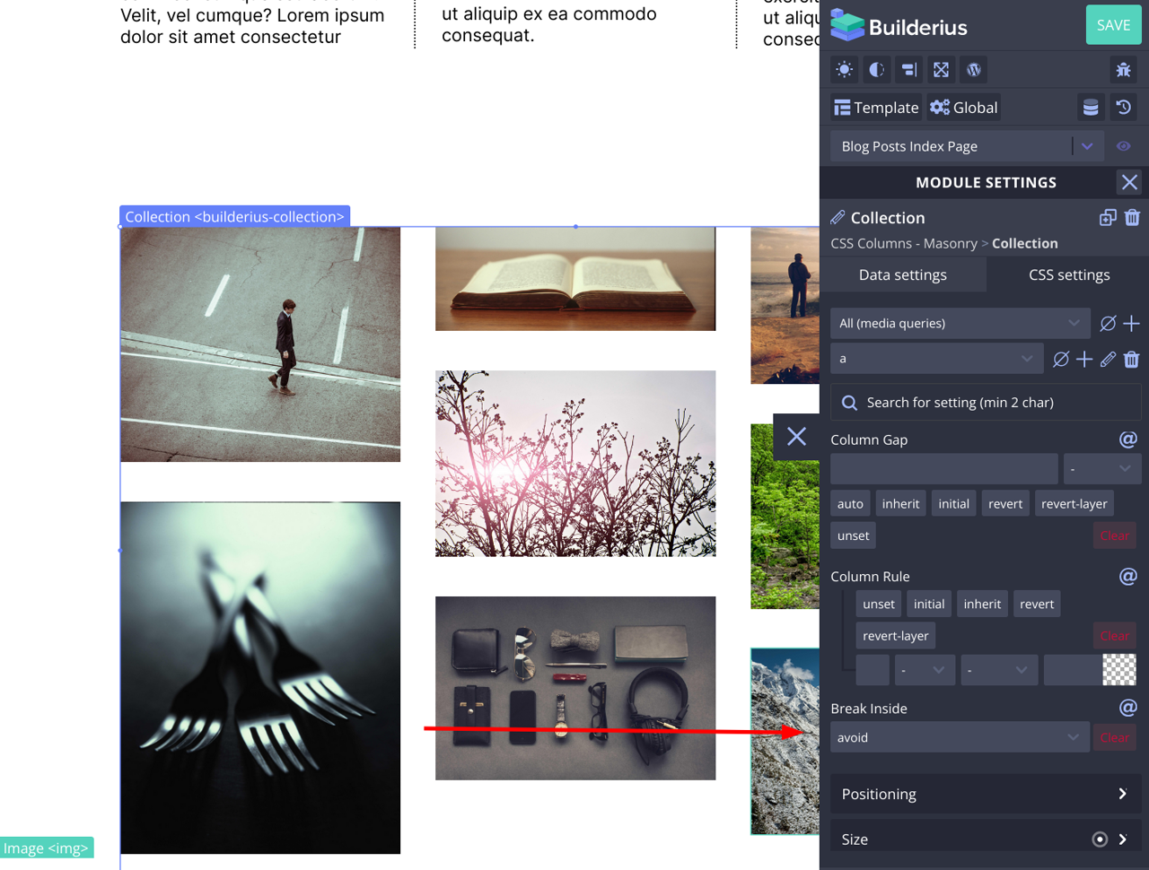
2. Set the CSS Column Styles on the Module That Wraps the Items
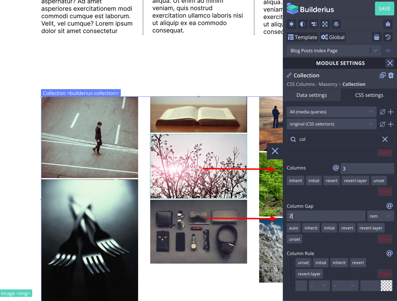
In the example of Dynamic Gallery, the wrapper module is a Collection module, so click on it, go to CSS Settings and search for Column. Fill in the values such as number of columns, gap etc and you have the masonry gallery.
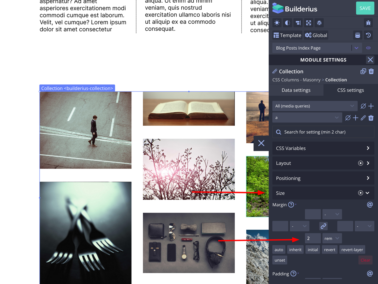
3. Set Up the Styles for Items in the Masonry Grid
Since columns are not a grid, you have to add bottom margin to items to have the same vertical gap. So first create a selector for top level items in the wrapper module you have. In my case this is a link.
If the item html element is not a block type html element, make it so. If you do not do this and the items have more then one element inside, for example if item is a card with image, title, excerpt etc, it is very likely that columns might break the card item accross two columns which will not look good.
In fact to avoid this you need two settings, display block for the item top element…
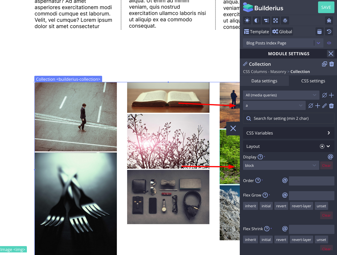
And set “Break Inside” setting to “avoid”. This setting can be found in Layout section close to Column related settings.
4. Add the Responsivness to the Masonry Gallery
Go back to the wrapper module, in my case this is Collection module, and add your minimal width for the column. Done you have created a CSS only, no code, cusom masonry gallery that is also responsive.
Remember, you can use this approach for your post grids, and any other layouts that are grid like. CSS columns work great both with text and block elements, so experiment and enjoy.