Create Magazine Inspired Text Layouts on the Web Using CSS Columns
 Elvis Krstulović
Since Builderius Website Builder version 0.13.0. we have introduced a native CSS columns feature to provide users with an elegant way to design multicolumn layouts for continuous text. It is important to note that this feature is not equivalent to what many Page Builders as well as Gutenberg Block editor refer to as the “Columns”. In such cases these are layout elements usualy powered by flexbox layout to provide multicolumn page layout. These are separate containers and the text cannot naturally flow from one column to another. The best way to achieve columns layout where content can flow from one column to another is to use CSS Columns, which I am goint to present here.
1. Prepare some layout structure
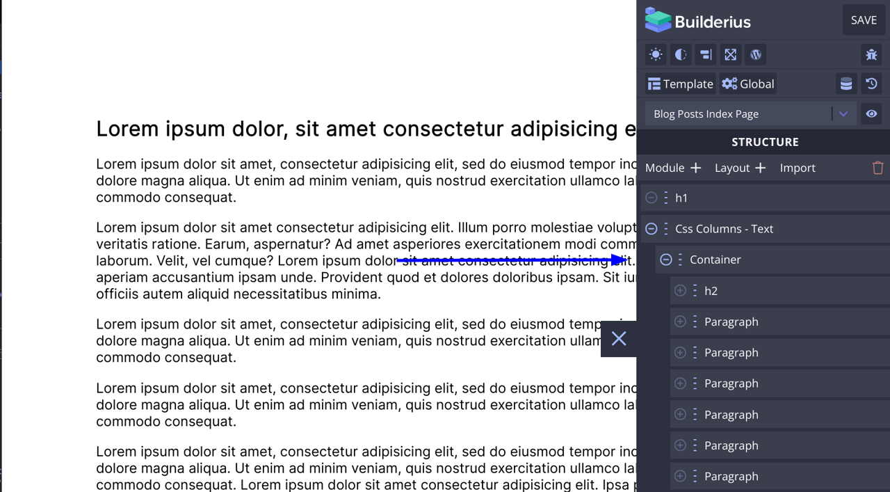
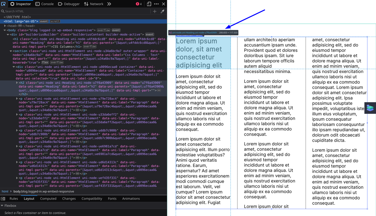
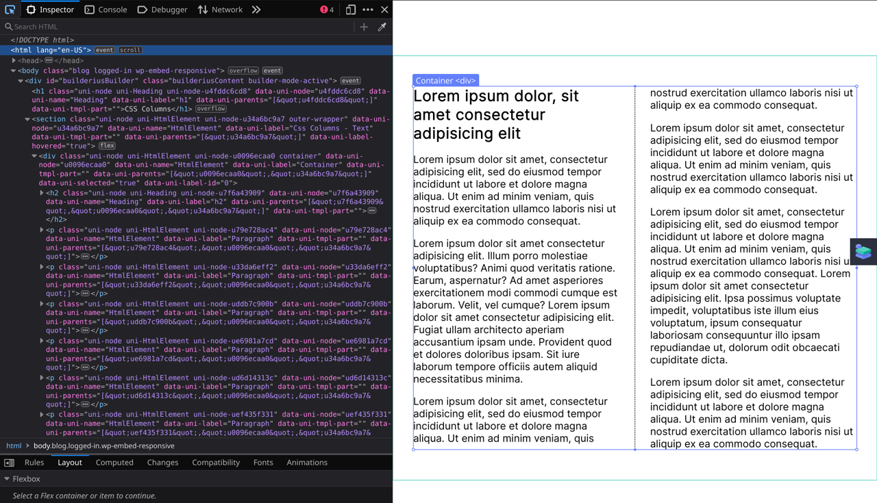
We are going to set everything using the html element that wraps all the text content. Inside of it you can notice we are using a mix of elements such as Headings and Paragraphs.
2. Columns controls overview
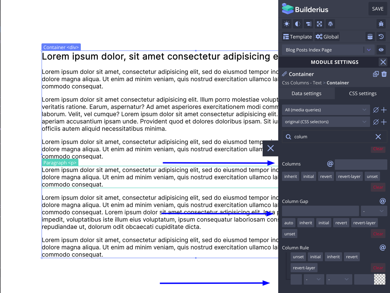
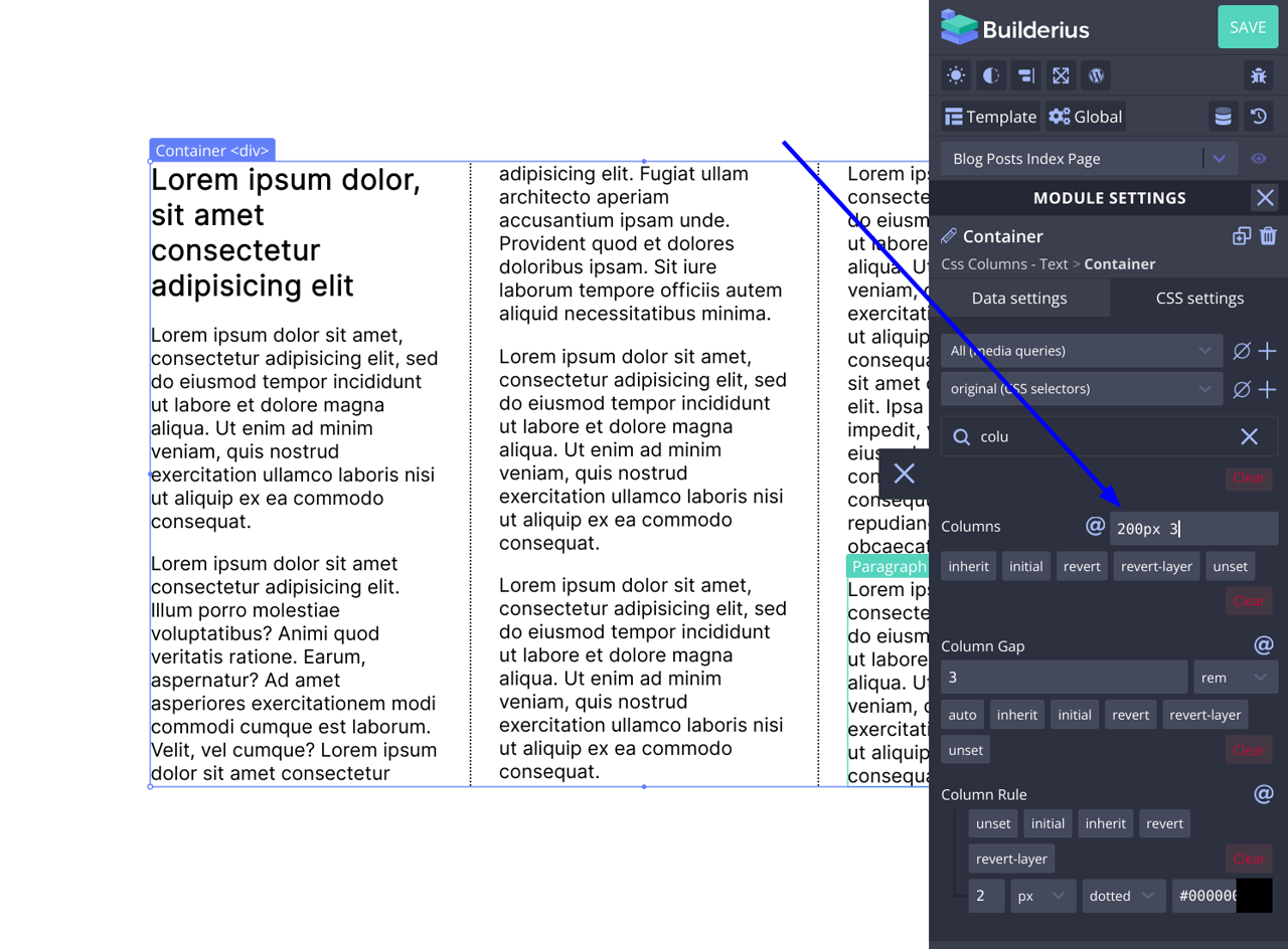
Click on the module that wrapps the text content, then go to CSS settings and search for “Column”. You should see these settings appear.
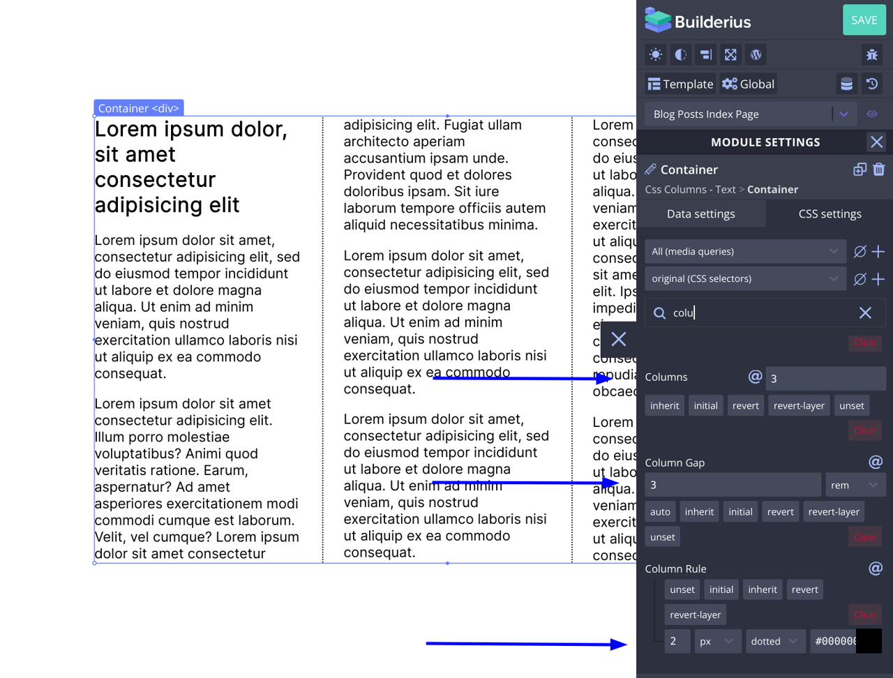
- Columns field is where you can set the number of columns you would like to have
- Columns gap field sets the distance between the columns
- Column rule sets the style for a “vertical rule” or a line that is to appear between the columns
3. Adding responsive controls
Similar to minmax() approach ofen used with CSS Grid to control the minimum with of the grid item, after wich the number of columns changes, columns field enables you to do almost the same. This syntax is a shorter version of “column-count” and “column-width” properties.
Here I set the layout where my columns will be 200px wide at minimum.
As I am reducing the width of the screen I came to the point close to 200px width of my columns (see tooltip in the image).
And when the screen become too small to acomodate the 200px column width if there are more then 2 columns, the layout rearanges into a two column layout.
And this is it, we have created a responsive, multicolumn text layout without using breakpoints, with Builderius Website Buidler version 0.13.0. without custom CSS code.